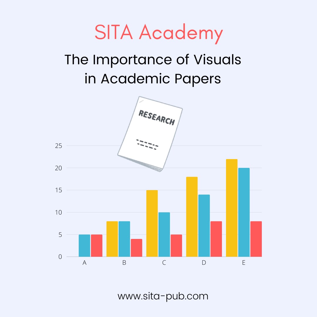
The Importance of Visuals in Academic Papers
Have you ever struggled with complex information in academic papers? For students and researchers, visuals are vital for clarity and engagement. This guide covers types of visuals, their benefits, common mistakes, and tools to create effective graphics, showing how they can enhance your work and captivate your audience.